


Give residents a warm welcome with colour
When designing properties, housing providers should think carefully about the colours used in each room and the emotions they evoke in building occupants. In this article, Dawn Scott, Senior Colour Designer at Dulux Trade explains what people want to feel in their homes and how colour and design can be used to improve occupant wellbeing and help to make a space more welcoming and homely.
For 21 years, Dulux colour experts and international design professionals have been coming together to conduct extensive trends research – and deciding on a Dulux Colour of the Year that reflects the current state of the world. This year, the team identified people’s need for simplicity, meaning and a sense of belonging, which resulted in the creation of Sweet Embrace™ - a delicate, optimistic and modern tone named by Dulux for its welcoming and soothing qualities.
To complement Sweet Embrace™ and provide even more colour inspiration, Dulux has also launched three versatile colour palettes. There is a Warm palette for comforting spaces, a Calm palette for quiet spaces and an Uplifting palette to create friendly spaces.
How can these colours be used in social housing?
The first step to selecting paint colours for social housing is to assess what the space will be used for. This will help to decipher how you want occupants to feel in the space – and therefore what colours to use to instil these emotions.
Entrance ways and corridors
When entering a property, occupants should feel instantly welcomed and relaxed. To achieve this with colour, we recommend warmer, more saturated hues like those on the Colour Futures™ Warm palette.
Alternatively, the bright tones in the Uplifting palette, like High Summer or Lilac Skies, work perfectly in these spaces as they bring a sense of joy and friendliness.
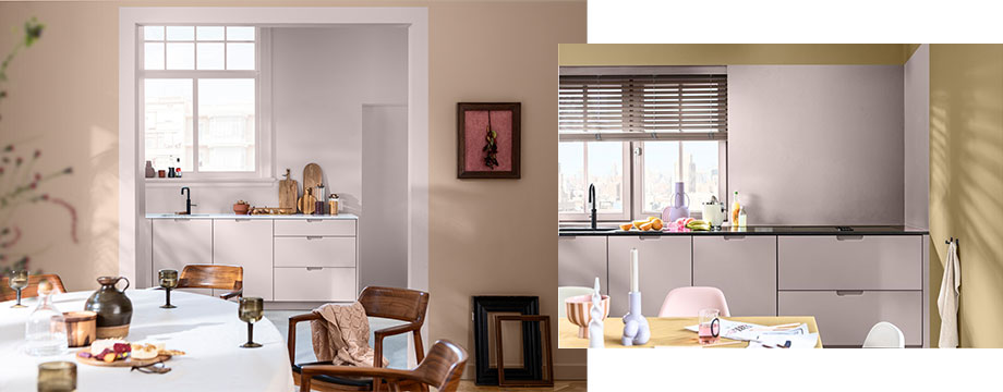
Kitchen and dining areas
In many homes, the kitchen is busy with regular hustle and bustle throughout the day. To reflect this energy with colour, use the modern tones in the Uplifting palette. Ochre-based shades like High Summer and Ochre Sands are ideal as they bring a sense of happiness.
However, some may see the kitchen and dining areas as peaceful and comforting – and a place to bring people together. The Warm palette comes into its own here, with Winter Pumpkin or Fireside Embers perfectly reflecting these emotions.
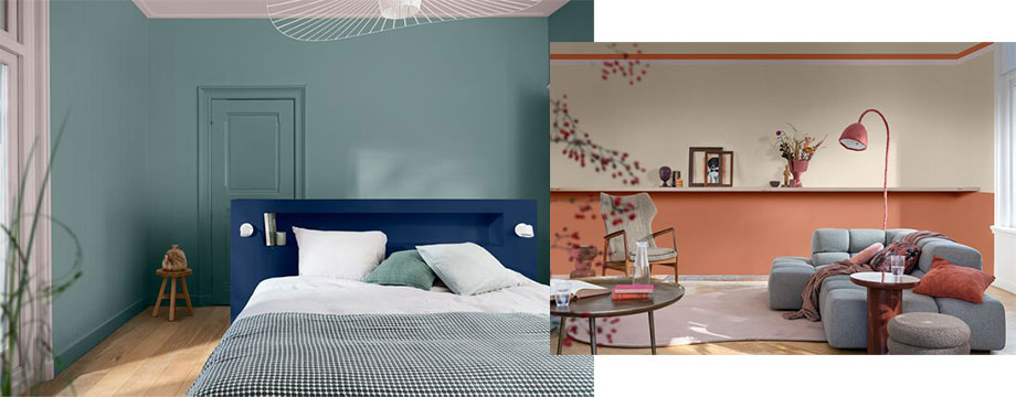
Bedrooms and living spaces
On entering the bedroom or living area, occupants should feel instantly relaxed, warm and cosy. The Warm palette can therefore be used here – however, the Calm palette should not be overlooked. Its soft blues, calming greens, neutral biscuit hues and dusty pinks are reflective of nature and can be used to create a sense of belonging – cocooning people in colours that are inspired by seascapes, woodlands, or bright skies.
Bathrooms
For many, the bathroom is a space for relaxation, and this makes the Calm palette’s nature-inspired tones the ideal choice to make people feel at ease. However, the bathroom is also one of the first rooms people enter each morning. The yellows and purples in the Uplifting palette can be used to bring energy, encourage a ‘get up and go attitude’ and ensure a positive start to the day.
Overall, the Dulux Colour of the Year 2024, Sweet Embrace™, and its supporting colour palettes provide the perfect inspiration when it comes to designing social housing. Each tone can be used to instil emotions in building occupants and boost wellbeing, but most importantly they can help to create homes that people will love and cherish.
The type of paint to choose for housing
As well as colour, it is also important to carefully think about the type of paint used and the benefits it offers. Opting for a durable product is ideal for areas such as hallways, kitchens and dining rooms. For example, the new Dulux Trade Diamond Matt has been designed for high traffic areas and delivers ultimate durability. It can withstand 10,000 scrubs – which is the equivalent of five hours non-stop scrubbing. Dulux Trade Diamond Matt can be repeatedly cleaned and scrubbed, ensuring that unwanted stains can be easily removed without damaging the paint film on the wall – making the professional finish last even longer. This product also supports sustainability goals as it is 99.9% VOC free.[1]
For further advice on specifying for housing projects visit: www.duluxtradepaintexpert.co.uk/en. For more information about the Colour of the Year 2024, visit: www.duluxtrade.co.uk/CF24
1 Based on in-can VOC content and measured in accordance with ISO 11890-2:2013.
Images © Dulux Trade
- Log in to post comments